Investly
7 March 2025
Services
UI Design
Onboarding Entry Point
Microcopy & Tone
Brand Symbol Design
Visual Hierarchy & Contrast


Understanding the Problem
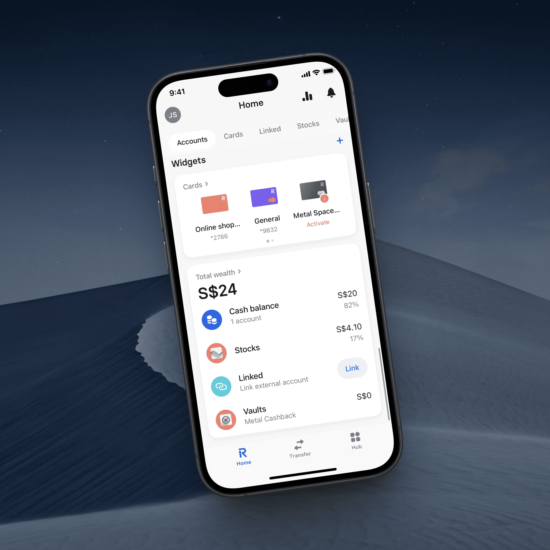
Making investing accessible to everyone
Investing still feels exclusive — many people believe it’s only for the wealthy or the financially educated. During research, I uncovered two key blockers: fear of making mistakes, and the belief that you need a lot of money to start.
Investly was created to challenge that. It had to feel simple, modern, and inclusive — something you’d want to open even if you’ve never bought a stock before.
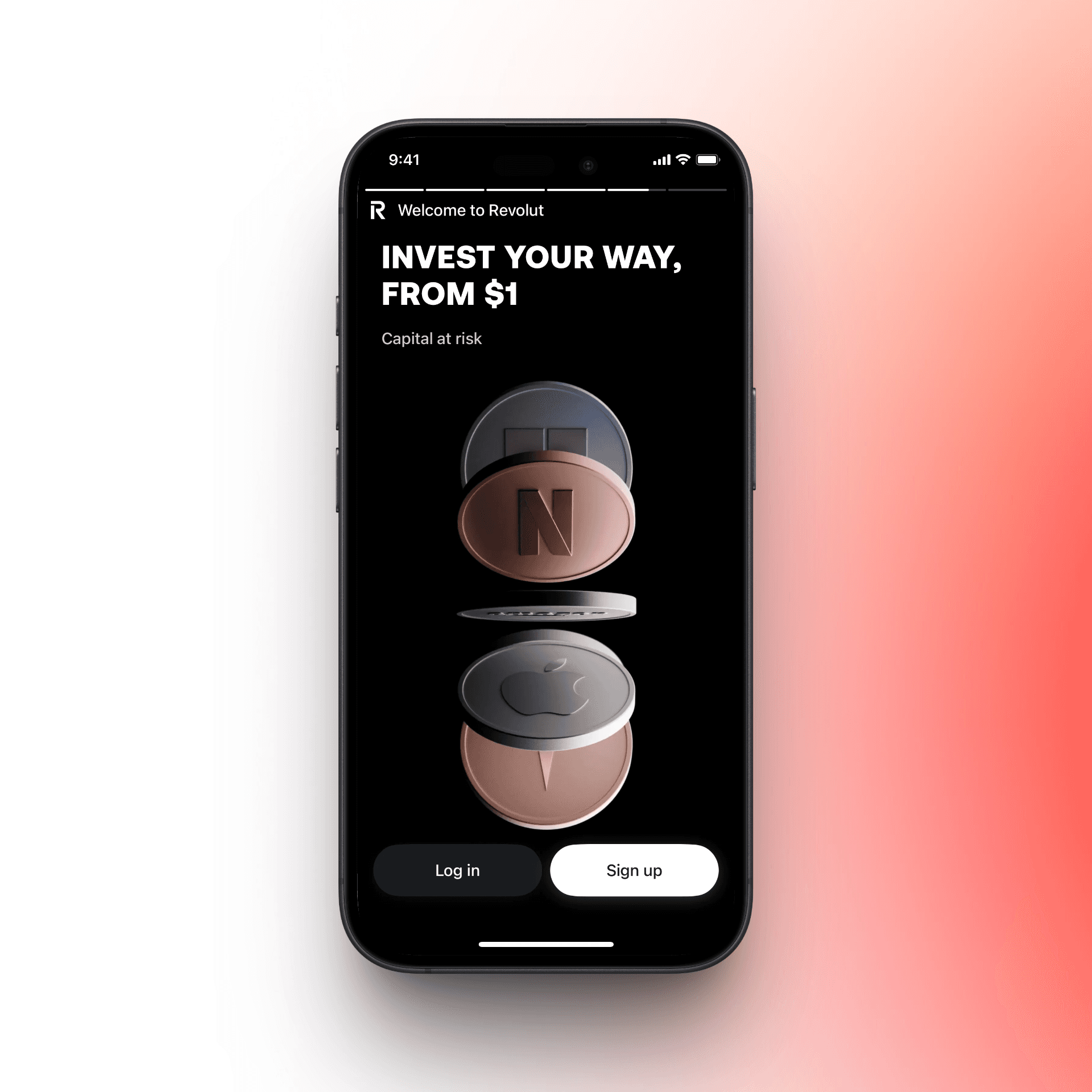
The goal: design a frictionless entry point into the world of investing, starting with just $1.

Designing trust through simplicity
Clear, calm, and confident onboarding
I focused on designing a streamlined onboarding flow that introduces users to the value of investing without overwhelming them.
The first screen is bold and reassuring: “Invest in top companies from just $1.” The interface uses large typography, soft gradients, and brand logos (like Apple and Netflix) to build trust instantly.
I also worked on a simple sign-up process, strong call-to-actions, and an overall structure that prioritizes clarity and emotional ease.
Every detail — from button labels to microinteractions — was designed to reduce friction and build confidence at every tap.